

Why we’re the Best Framer Agency in the World
At Deserve Studio , we don’t just use Framer . We stretch it, hack it, and shape it around real business needs. We don’t believe in generic templates or cookie-cutter designs.
Every line of code, every animation, and every CMS decision is made to solve a real problem. And after building 60+ websites for brands of all sizes, we’ve developed a unique perspective on what makes a Framer project truly great.
We’re sharing 25+ of our most ambitious Framer websites. If you’re a founder, marketer, or product lead looking for a Framer expert or a no-code development agency that knows how to go beyond the surface, this is for you.
Roamless
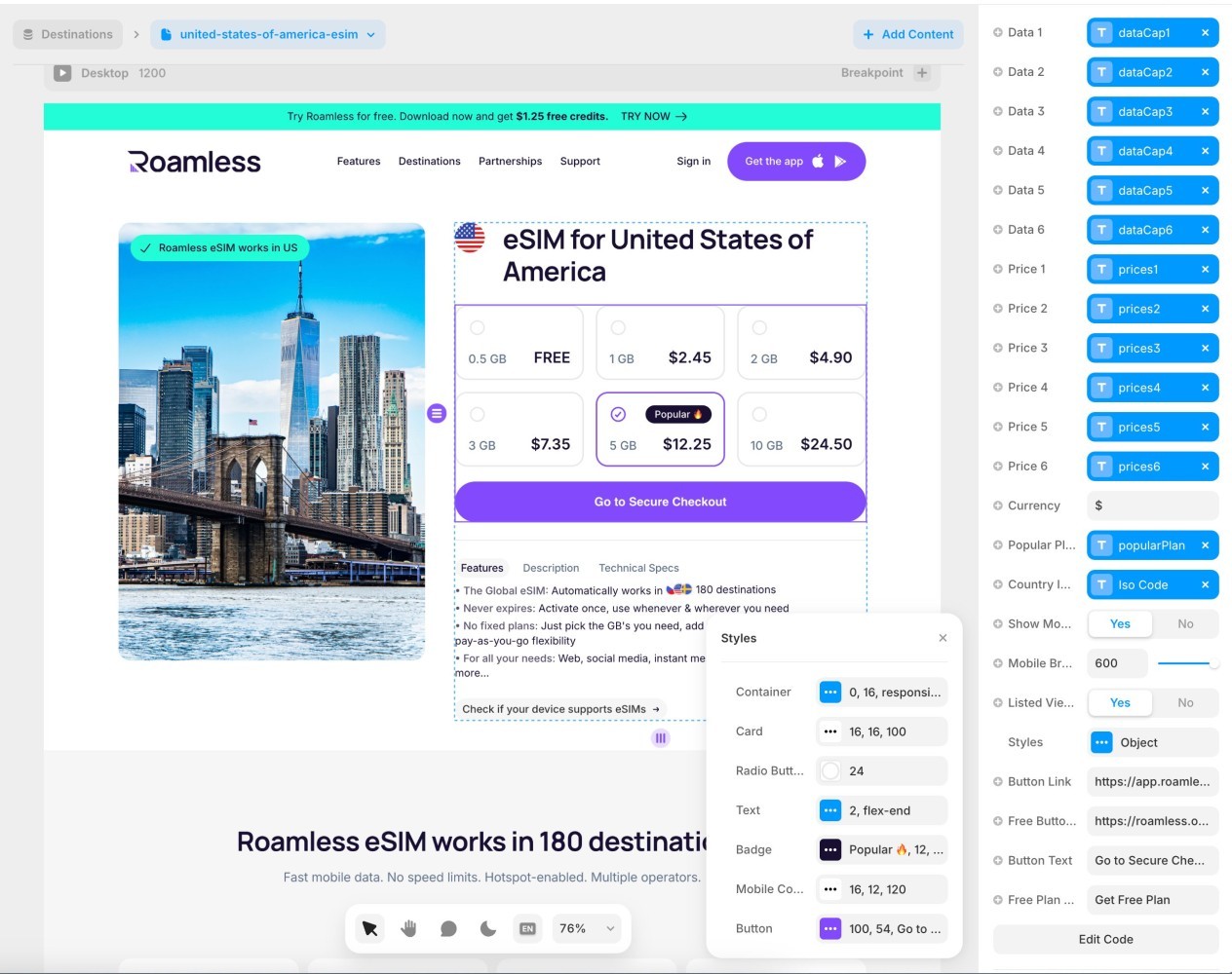
Roamless is by far the most technically advanced Framer project we have worked on, and likely one of the more complex production websites ever built on the platform.
We worked with Roamless for approximately three years, starting with their very first Framer launch and continuing as the product expanded internationally. Over time, the website evolved far beyond a typical marketing site into a large-scale acquisition, content, SEO, localization, and e-commerce infrastructure.
The project included:
50+ static pages, 500+ blog posts, 250+ destination CMS entries, and several additional CMS collections
Full localization architecture supporting 12+ languages and locales
A custom tracking system that preserves acquisition parameters across pages, sessions, dynamic CTAs, QR codes, and external checkout flows
Dynamic QR code generation integrated with AppsFlyer, allowing visitor-specific attribution and deep linking into the mobile app
Multiple custom-built data plan components with dynamic pricing calculations, free-data logic, CMS integrations, and user-controlled GB calculations
A fully custom fuzzy search engine working across multiple CMS collections, including aliases, localized content, destination prioritization, deduplication, and enriched results
Custom code overrides capable of injecting contextual promotion blocks directly into CMS-generated blog content
Dynamic marketing banners that automatically change based on destination, blog content, campaign context, or active promotion
CMS-driven popup systems triggered by scroll percentage, timing, page context, and campaign conditions
Country-level feature toggles used to activate different layouts and experiences, allowing controlled A/B testing without duplicating page infrastructure
Partner discount and campaign systems capable of automatically modifying displayed prices and checkout behavior
Custom pagination, CMS counters, reading-time calculations, social sharing functionality, and numerous utility overrides
SEO and technical infrastructure
A significant part of the project also involved maintaining the technical SEO integrity of a website operating across hundreds of pages and more than a dozen locales.
Implementation and maintenance of structured data using Schema.org
Custom structured-data configurations for different page types and CMS content
SEO architecture for localized pages, dynamic destinations, articles, and other programmatically generated content
Large-scale redirect architecture for URL migrations, deprecated pages, changed slugs, and legacy routes
Continuous redirect maintenance as the content structure evolved
Canonical URL and localized-page considerations across the international site structure
Preservation of tracking parameters without compromising crawlable and indexable URLs
Metadata and page-level SEO configuration across both static and CMS-generated pages
The result was a Framer implementation operating much closer to a custom web application and content platform than a conventional marketing website.
What changed over those three years
We built the first version from the first pixel, then stayed while the company grew around it. Roamless went from serving roughly 100 countries to more than 200 destinations, raised a $6M seed and then a $12M Series A, brought in new investors, grew the team and shipped new products. Every one of those changes landed on the website first, which is the real test of whether an architecture was designed properly rather than just built.
The outcome
Conversion rates more than doubled within a week of launch
Landing page performance nearly tripled over the same period
Three years of continuous production across a dozen locales, through a $6M seed, a $12M Series A and an expansion from roughly 100 countries to 200+ destinations
Selim Aykut, Co-Founder at Roamless: the team breathed new life into our website. After launch, within just a week, we saw our conversion rates skyrocket, more than double. Our landing page performance nearly tripled.
After three years the site moved in-house, so that the Roamless developers could integrate it directly with their own app and backend systems. What we handed over remains one of the strongest examples of how far Framer goes across custom development, CMS architecture, localisation, SEO, analytics, experimentation and application-level functionality.
Ozone
Ozone is the fastest way to create engaging short-form video. A site selling speed cannot feel slow, and a site selling playfulness cannot feel careful.
The problem
Product-led tools in crowded categories get one scroll to prove they are different. Feature copy does not do it, because every competitor claims the same features. The proof has to be in how the page itself behaves.
What we did
Built the landing page around micro-interactions rather than sections, with effectively every element animated
Used motion as the primary brand expression instead of layering it on top of a static layout
Kept the interaction density high without letting the page become noisy, which is the actual difficulty
Evolved the site alongside the product across a multi-year partnership from 2022 to 2025
Built responsive behaviour deliberately per breakpoint rather than scaling the desktop layout down
The outcome
The site went viral on social media at launch and was widely shared across the design and product community
A page people explore rather than scroll, which is a different metric from time on page
Enough organic reach that the website itself became the campaign
Max von Wolff, CEO at Ozone: Deserve Studio exceeded our expectations, crafting a product-centric, detail-oriented landing page with remarkable speed and precision. Their dedication to their craft resonated across social media, generating significant buzz and engagement for our website.
Frigade
Frigade is the modern product adoption platform: embeddable UIs, flexible APIs, and everything a team needs to ship onboarding faster.
With over 20 pages, Frigade required custom logic across multiple touchpoints, alongside a brand and 3D system built specifically for the launch.
20+ pages designed and built in Framer
A pricing calculator powered by range input
Animated counters and flip-card components
Scroll-based text reveals
Character-limited input fields with validation
Social media sharing widgets
Custom 3D visuals and brand work across the site
What happened next
The engagement did not end at launch. Frigade came back for a second project, and then brought us the custom development work as well. That is the part we are proudest of: the first project was won on craft, and everything after it was won on trust.
Eric Brownrout, CEO at Frigade: we had the pleasure of working with Deserve Studio to redesign our landing page, and we were so impressed with the results that we worked with them again for a second landing page for a new project. We were initially drawn to Deserve Studio for their craftsmanship. However, what later stood out was their collaborative design process.
A developer tool website has to prove competence in the first scroll. Frigade does it through interaction rather than copy.
Screenloop
Screenloop is an AI-powered talent operations platform combining applicant tracking, interview intelligence, automation, and analytics to help teams hire faster and more fairly.
20+ pages built around interaction-first design. The homepage and product pages feature layered animations and subtle motion patterns that feel fast and intentional.
20+ pages designed and built in Framer
Layered animation system across the homepage and product pages
Brand expression and design system supporting a broad product surface
Motion patterns tuned to feel fast rather than decorative
Responsive implementation across breakpoints
A platform with this many modules usually produces a website that reads like a feature list. This one does not.
Rise Calendar
Rise makes it easy to go as simple or as complex as you want, and the website carries the same lightness.
Lightweight and smooth. Parallax effects, background scroll overrides, and elegant text transitions come together in a way that feels effortless.
Landing page design and full Framer development
Parallax and background scroll overrides
Text transition system used across the page
Motion design tuned for a calm, low-friction feel
Responsive implementation across breakpoints
Effortless is the most expensive quality to build. Nearly all of the work here went into things that are meant to go unnoticed.
B3.fun
Created by a team of Base and Coinbase alumni alongside OG Ethereum contributors, B3 is a horizontally-scaled gaming ecosystem built on Base.
Powered by live data, the site delivers real-time updates with smooth transitions and standout visuals, held together by heavy 3D and motion work.
Landing page design and full Framer development
Live data feeding real-time on-page updates
Custom 3D visuals across the ecosystem story
Motion design across sections, transitions, and interactive moments
Ongoing collaboration through 2024 and 2025 as the ecosystem expanded
Responsive implementation across breakpoints
Gaming audiences have a very low tolerance for websites that feel slower than the products they are selling.
Instant
Instant is a landing page builder for Shopify merchants who need pages that are both fast and high-converting.
A minimalist landing page with the integrations and utilities a growth-stage SaaS actually needs.
Framer development for the marketing site
Countdown component
Custom HubSpot integration
Social media share buttons
Marketing support alongside the build
Responsive implementation across breakpoints
Restraint is a choice. For a product that sells simplicity, anything else would have undermined the pitch.
Doconomy
Doconomy works at the intersection of finance and climate impact, and the website had to make that data legible rather than decorative.
We built animated data visualizations that can be exported as videos. These are not simple Lottie files. They are real-time Framer components with motion logic built in.
Custom animated data visualization components built natively in Framer
Video export capability built into the visualization system
Real-time motion logic rather than pre-rendered animation
Responsive implementation across breakpoints
Building the visualizations as live components rather than exported files meant the data could keep changing without the design going stale.
Brainbase
Brainbase moves repetitive workflows off your team and onto AI workers, at a fraction of the cost.
Full dark and light mode support with advanced animation, and a custom AI chatbot window built with override logic.
Landing page design and full Framer development
Complete dark and light mode system
Advanced animation across sections and transitions
Custom AI chatbot window built with Framer code overrides
Responsive implementation across breakpoints
Letting visitors try the product on the marketing page removes a whole step from the funnel. That was worth building properly.
AG2
AG2 helps teams build production-ready multi-agent systems in minutes rather than months. We matched that promise with the timeline, and then stayed.
The entire experience, design and development, went live in under twenty hours. That number includes the client feedback and iteration loop, not just our production time. The AG2 team reviewed and responded fast enough that the round trips fit inside the same day, which is the only reason a twenty-hour launch was possible at all.
Full design and Framer development delivered in under 20 hours, client review rounds included
A fast feedback and iteration loop run directly with the founding team rather than through a process
A pixel-based animation system built specifically for the launch
A split-screen hero showing the journey from agent development to deployment
Brand expression paying homage to classic operating systems and pixel art without losing modern usability
Performance-first implementation with a deliberately restrained interface
Responsive implementation across breakpoints
What started as one fast launch turned into an ongoing partnership. We have kept working with AG2 through 2026, and the split-screen hero from that first build became a cornerstone of how they communicate the platform.
Qingyun Wu, Founder of AG2: working with Deserve Studio on the AG2 website was a fantastic experience. They took our vision of creating a unique, playful yet professional design and executed it perfectly. Our request was challenging: we wanted to pay homage to classic operating systems and pixel art while maintaining modern usability and conveying complex technical concepts.
Speed is a feature. Delivering the site that quickly was part of the argument, and the two years since are the rest of it.
Two Boxes
Two Boxes builds returns processing software for e-commerce operations teams.
Advanced card animations with hover states and scroll reveals, put together into a smooth, product-centric experience.
Landing page design and Framer development
Advanced card animation system with hover states
Scroll reveal choreography across the page
Responsive implementation across breakpoints
Operations software is not glamorous. Making it feel considered is most of the work.
Conway Expert
Conway & Co helps consumer and retail brands succeed in digital commerce through strategic insight, technology guidance, and practical resources on AI and e-commerce.
Scroll-based storytelling and structured motion design, used to support clarity in positioning rather than to decorate it.
Landing page design and full Framer development
Scroll-based storytelling structure
Structured motion design across sections
Marketing visuals produced for the consultancy story
Responsive implementation across breakpoints
For a consultancy, the website is the proof of the thinking. Structure was doing more work here than styling.
Conway World
Conway & Co helps consumer and retail brands succeed in digital commerce through strategic insight, technology guidance, and practical resources on AI and e-commerce.
We built two separate properties: the consultancy site, and Conway World, an online magazine for digital leaders in e-commerce. Two different audiences, two different reading rhythms, two different builds.
Conway Expert
Scroll-based storytelling and structured motion design to support clarity in positioning
Landing page design and full Framer development
Marketing visuals across the site
Conway World
Dynamic variant activation through a #variant URL structure
A blog content override that inserts dividers and inline elements directly into CMS-generated articles
Kit.com mailing integration
CMS architecture for an ongoing editorial publication
Aurelija Vycaite, Head of Marketing at Conway & Co: Deserve built our homepage and content platform on Framer, and the result is exactly what we needed: flexible, reliable, and beautifully on-brand. The components they designed are intuitive to use and easy to customize, no handholding required.
A consultancy site sells judgement. A magazine sells the habit of coming back. Building them separately was the only way to let each one do its own job.
IO
IO.NET Cloud is significantly better, faster, and cheaper than the alternatives on the market, and the website had to carry that confidence without overselling it.
Clean and shiny UI with bold interactive moments and modern transitions, built on a design system that keeps a fast-moving crypto and AI product consistent as it grows.
Landing page design and full Framer development
Design system covering components, typography, and color
Motion design across sections and transitions
Bold interactive moments used sparingly, where they earn attention
Responsive implementation across breakpoints
The design system was the real deliverable here. The launch page was just the first thing it produced.
Hackajob
Hackajob is a hiring marketplace connecting technical talent with companies.
The build includes scroll-triggered effects, a fully animated logo, and a page structure designed to scale as the content grows.
Landing page design and Framer development
Scroll-triggered effect system
Fully animated logo built in Framer
Structured page layout designed for scale
Responsive implementation across breakpoints
The structure mattered more than any single animation here. It is what lets the site keep growing without a redesign.
Talkdesk
Talkdesk runs a large global team, and the careers site had to hold a constantly changing set of roles without becoming unmanageable.
Built for large teams with advanced CMS filtering, category logic, and clean structure.
Careers site design and Framer development
Advanced CMS filtering across roles and locations
Category logic driving the browsing experience
Clean structural system built for continuous updates
Responsive implementation across breakpoints
A careers site is a CMS problem disguised as a design problem.
Wamo
Wamo is a business banking platform for small companies and freelancers.
20+ pages. Fluid animations. Responsive, modern, and frictionless.
20+ pages designed and built in Framer
Fluid animation system across the page set
Responsive implementation across breakpoints
A structural system that keeps a large page count consistent
Consistency across twenty pages is a harder problem than polish on one.
Onlyforms
Onlyforms is a form product built for teams who need more than what standard builders offer.
Animated cards, scroll-based transitions, and a custom form builder integrated directly into Framer.
Landing page design and Framer development
Custom form builder integrated into Framer
Animated card system
Scroll-based transitions across the page
Responsive implementation across breakpoints
Building the form experience inside Framer rather than embedding a third-party tool kept the whole thing consistent.
Billin
Billin is invoicing and billing software for small businesses.
Scroll storytelling and animated card structures with a clear content hierarchy.
Landing page design and Framer development
Scroll storytelling structure
Animated card system
Clear content hierarchy across a dense product story
Responsive implementation across breakpoints
Financial tools have a lot to explain. Hierarchy does more work than motion here.
Alisgidis
Alisgidis is a digital shopping mall offering shopping opportunities with safe and easy payment options.
Built for travelers, with subtle 3D effects, scroll animation, and visual storytelling across both the mobile app and the marketing site.
Mobile app design for the shopping experience
Landing page design and Framer development
Product design across the core flows
Subtle 3D effects and scroll animation
Motion design and marketing visuals
Responsive implementation across breakpoints
E-commerce design is mostly about removing hesitation. Everything here is pointed at that.
Create Video
Create Video was our own product: AI-powered, studio-quality screen recording for product videos, help centres and documentation.
We built it the way we build client work. Brand, product design, the recording and editing experience, the marketing site and the visuals around it were all handled in-house.
Product design across the recording and editing experience
Brand identity and visual system built from scratch
Landing page design and Framer development
Subtitle components and responsive layout work
Immersive animation across the marketing site
Marketing visuals produced alongside the product
Where it stands
Create Video was where we tested things we would not risk on a client's timeline: the recording flow, the subtitle system, the motion language.
We stopped developing it as a commercial product, but we did not shelve it. It became an internal tool, and we still use it ourselves.
That is a fair outcome for a studio product. Most of what we learned here left the project anyway, and went into work that shipped for clients.
Defend Saas
Defend SaaS is a security product for software teams.
The build includes subtitle components, responsive layout work, and immersive animations across the page.
Landing page design and Framer development
Subtitle component system
Immersive animation across sections
Responsive implementation across breakpoints
Braavos
Braavos is a smart wallet for the Starknet ecosystem.
The build includes wallet logic, a full dark and light design system, and motion-heavy interface work.
Landing page design and Framer development
Wallet logic implemented on the marketing site
Dark and light design system
Motion-heavy interface work across sections
Responsive implementation across breakpoints
Crypto wallets have to look trustworthy and capable at the same time. That tension shaped the whole visual system.
Pure Landing Page
PureLanding is different from the other projects on this list because it is our own product, built and continuously operated entirely on Framer. It is a completely free inspiration platform where designers can discover landing pages and references from real digital products.
Today, PureLanding contains more than 5,000 CMS items, and new content continues to be added on an ongoing basis.
5,000+ CMS items running inside Framer
Completely free landing-page inspiration platform
Used by thousands of designers for visual and product inspiration
Continuously growing content library
Large-scale CMS architecture, categorization, filtering, and content management
Performance-optimized custom filtering, search, and layout logic
Built and maintained entirely within Framer
For us, PureLanding is also a practical demonstration of how far Framer's CMS can be pushed when the underlying architecture is designed correctly.
Anyone can build on Framer.
We build what others say isn’t possible.
